

Raven Dark Icon Pack
Creativepixels
I installed Raven Dark Icon Pack with one simple goal: to see whether a paid dark icon pack can make an Android home screen feel more coherent without turning customization into a weekend project. My conclusion is fairly clear. This is a focused personalization app for people who already enjoy a dark, tidy visual style and want their icons to stop clashing with a darker wallpaper or theme. It is less convincing for anyone who expects a complete launcher makeover, automatic support for every app, or a large customization system in one purchase.
Created by Creativepixels, the app takes a narrow approach rather than trying to become an all-purpose home-screen toolkit. That focus is useful. Instead of asking you to rebuild every part of your phone, it gives your app drawer and home screen a darker visual direction. I found that the real decision is not whether dark icons look attractive; they do. The important question is whether your current launcher can apply an icon pack comfortably and whether enough of the apps you use will fit the same visual language.
What to decide before installing it
The first thing I would check is your launcher. Icon packs are not completely independent wallpaper applications; they rely on launcher support and on the launcher’s own interface for applying them. If your launcher has an icon-pack option, the setup should be straightforward. If it does not, the purchase may not help much, even if the artwork itself suits your taste. This is the most important practical filter, and it is easy to overlook when browsing personalization apps.
I would also decide how much visual consistency you actually need. A dark icon pack works best when your most-used shortcuts share a similar appearance. If your first home-screen page contains only familiar apps, a few unsupported icons may not bother you. If you keep several pages of shortcuts, folders, widgets, and work tools, mismatched icons become more noticeable. In that situation, the quality of the experience depends as much on your app mix as on the pack itself.
There is also a difference between wanting a dark mood and wanting a completely monochrome interface. Raven’s identity is built around darkness, but that does not automatically mean every element of your phone will become uniform. Your wallpaper, widgets, notification shade, search bar, and launcher labels remain part of the final result. I recommend treating the icon pack as one layer of a theme rather than expecting it to transform the entire operating system.
Related News

Why WhatsApp Messenger Still Makes Everyday Communication Feel Easy

Jurassic World: The Game Is the Better Dino Tycoon for Strategic Players

Threads in Real Life: Who Should Join, Lurk, or Leave

How SHEIN Turned Shopping Into an Endless Content Feed

How to Make Fortnite Feel Smarter on Mobile

Should You Switch to Microsoft Outlook on Mobile?
The app is listed for Everyone, which makes it an easy option to consider for a shared family device or a personal phone used by different age groups. It is also a small, focused purchase rather than a subscription decision. The listed price is $0.69, so the financial risk is low, but a low price does not remove the compatibility question. A cheap icon pack that cannot be applied in your launcher is still a poor purchase.
Creativepixels has positioned this as a dedicated personalization app, and that description fits my experience. I would not choose it because I wanted automation, custom widgets, animated effects, or a full launcher replacement. I would choose it because I wanted the icons themselves to establish a darker visual rhythm. That distinction helps avoid disappointment and makes the app easier to compare with the usual alternatives.
The visual change is strongest on a carefully edited home screen
My favorite way to use a dark icon pack is on a home screen with fewer shortcuts. When every app is competing for attention, changing icon artwork can make the screen look different without making it feel calmer. By contrast, a short row of essential apps gives the style room to work. I would keep only the apps I open several times a day on the first page, move occasional tools into folders, and then judge the pack from that cleaner arrangement.
Gallery
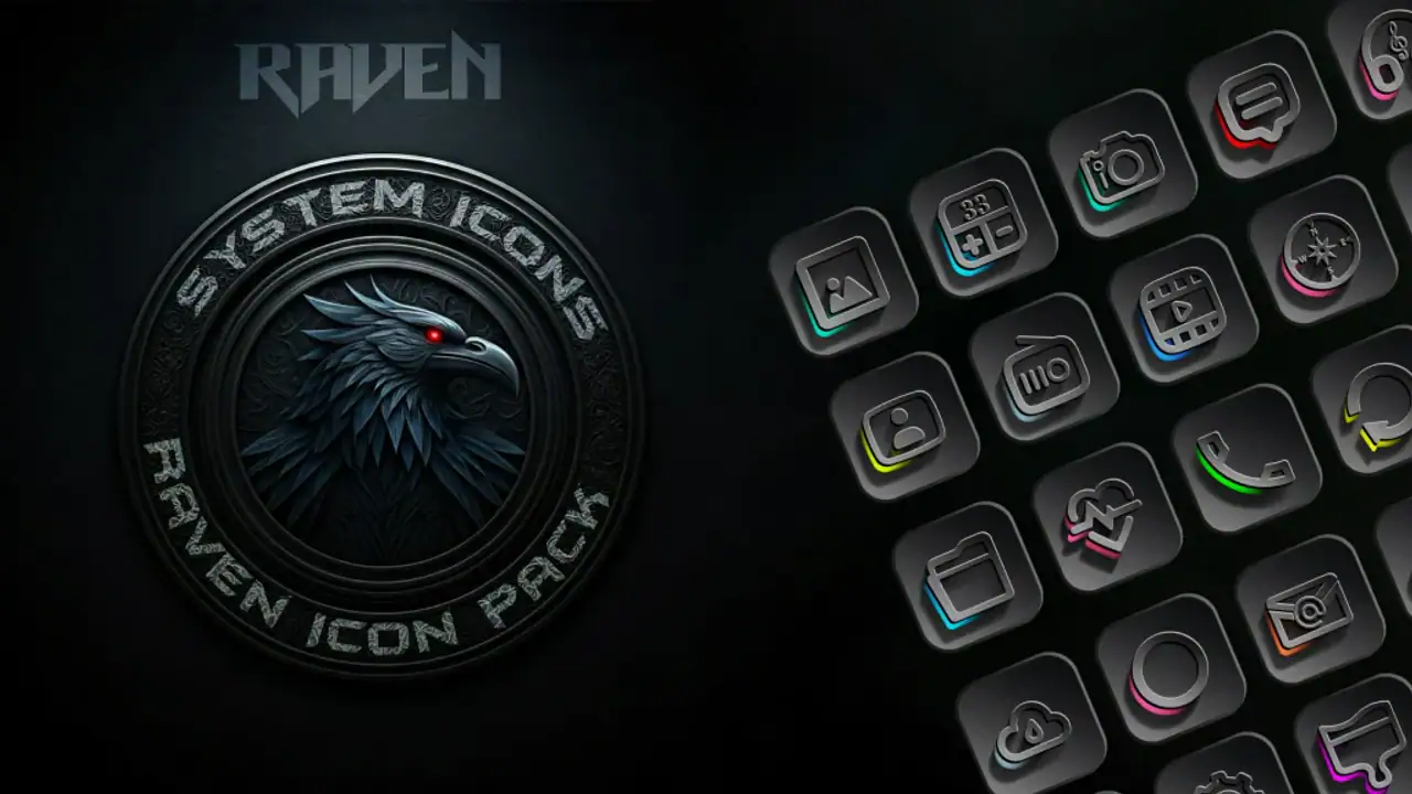
This is one of the less obvious trade-offs: the pack encourages better home-screen editing, but it cannot do that editing for you. If your layout is crowded, you may initially blame the icons for a busy appearance that actually comes from too many shortcuts. I found that removing visual clutter before applying a new style gives a more honest impression of what the artwork contributes.
Wallpaper choice matters just as much. A very bright or highly detailed wallpaper can fight with dark icons, especially when both contain strong shapes. A restrained background usually makes the icons easier to read. I would test the pack with the wallpaper you use every day, not only with a dramatic promotional-looking background. Personalization should survive ordinary use, including checking the phone outdoors or glancing at it quickly while distracted.
Widgets create another practical consideration. A dark icon set can look polished beside a simple clock or weather widget, but a colorful widget may become the dominant visual element. That is not necessarily bad, yet it means the finished screen may feel mixed rather than unified. I prefer choosing the widget after the icons, because the icon style gives me a clearer baseline for deciding whether the rest of the screen needs to be quieter.
Where the focused design wins
The strongest advantage is clarity of purpose. I did not have to navigate a complicated customization suite to understand what this app was for. Its value is immediately visible after the icons are applied: the phone feels more intentional, particularly when the default icon set is bright, inconsistent, or visually dated beside a dark wallpaper.
That focus also makes it a sensible choice for someone who wants a small change rather than a new phone experience. A launcher replacement can alter gestures, app-drawer behavior, search placement, and other habits. An icon pack is much less disruptive when the launcher already suits you. You keep the layout and controls you know while changing one of the most visible parts of the screen.
Another strength is the low commitment. At $0.69, this is an inexpensive experiment for a user who already knows they like dark themes. I would still check compatibility first, but the purchase is easier to justify than a larger customization bundle when the only thing you want to change is icon appearance.
The app also benefits from being easy to understand for people who do not want to learn design terminology. You do not need to know about grid systems, icon masks, or launcher internals to appreciate the basic result. The useful workflow is simple: apply the pack, inspect the most-used page, identify any icons that do not match, and decide whether the remaining inconsistencies are acceptable.
Its current version is 1.3.0, and the app was released on Jan 1, 2025. Those details matter mainly because icon-pack users depend on ongoing compatibility with the apps and launchers around them. I would keep the app updated when an update is available, but I would not assume that a version number alone guarantees perfect coverage for every newly installed application.
Small checks that improve the result
One useful habit is to test the icons on your actual first page before reorganizing the whole phone. This avoids spending time rebuilding folders around a style you may decide is too subtle or too dark. I would apply the pack, leave the phone in its normal layout for a day, and pay attention to whether I can find essential apps quickly. A style that looks excellent in a screenshot can be less practical when you are searching by shape and color from memory.
I would also keep a short list of unsupported or visually inconsistent apps. That list tells you whether the problem is occasional or central to your routine. If your banking, messaging, calendar, and work apps all look coherent, one odd icon may be harmless. If the apps you open most often remain unchanged, the overall effect may not justify keeping the pack.
Folders are a good way to manage that issue. Rather than scattering unmatched icons across the home screen, I would place less frequently used apps inside folders and reserve the visible area for shortcuts that fit the chosen style. This is not a feature I would attribute to the app itself; it is a practical way to get more value from a focused icon pack when coverage is uneven.
Finally, compare the result at different brightness levels. Dark artwork can look elegant in a dim room and less legible in strong daylight. If you often use your phone outside, readability should carry more weight than whether the screen looks perfectly coordinated at night. I prefer a slightly less dramatic arrangement that stays easy to scan throughout the day.
When a different category is a better fit
The usual alternative is a free icon pack. That route can be sensible if you are experimenting with dark styling and do not yet know whether you will keep it. Free options may also suit users who want to try several visual directions before settling on one. The trade-off is that you may spend more time comparing packs, dealing with inconsistent artwork, or living with a design that does not feel as deliberate.
A broader customization suite is better for someone who wants icons, wallpapers, widgets, fonts, and lock-screen elements to follow one coordinated theme. I would choose that category when the icon change is only one part of a larger redesign. Raven Dark Icon Pack makes more sense when you already like your launcher and widgets and want to improve the icons without replacing everything else.
A launcher with built-in theming may be the stronger choice for users who want control over icon size, spacing, labels, gestures, and app-drawer behavior. That kind of solution can produce a more complete result, but it also changes more of your daily routine. If you are happy with your current launcher, switching just for a theme may create unnecessary friction.
There is also a case for staying with the default icons. If you depend on color recognition to open apps quickly, a darker set may slow you down. People with accessibility needs, older devices, or very busy work screens should prioritize contrast and recognition over visual mood. In those cases, the default system design or a high-contrast option may be more practical than a dark aesthetic.
I would skip this app if you use an operating system or launcher that does not support third-party icon packs, if you want every app to have a matching icon, or if your main goal is to customize widgets and lock-screen controls. I would also hesitate if you frequently install niche apps. The more unusual your app collection, the more likely it is that the finished screen will contain visual exceptions.
The real cost is switching, not the purchase
The money is the easy part. The more meaningful cost is the time spent applying the pack, checking your layout, and deciding what to do with icons that do not fit. If you like changing your home screen, that process can be enjoyable. If you want a one-tap result with no follow-up adjustments, even a low-cost icon pack may feel like work.
Before buying, I would take a quick screenshot of the current home screen. That gives you a reference when comparing the new look and makes it easier to return to your familiar arrangement if the darker style does not work. I would avoid changing wallpaper, widget layout, and launcher settings all at once, because then you cannot tell which change improved or weakened the experience.
It is also worth considering how often you change phones. A person who keeps the same Android setup for a long time may get more everyday value from a small visual refresh. Someone who changes devices frequently may prefer a free option or a broader theme that can be reused across more of the interface. The purchase is modest, but the usefulness depends on how long the style remains part of your routine.
The app has an average rating of 4.5 from around 370 ratings, with about 50 written reviews, and it has passed 10K+ installs. I read those figures as a sign of real interest rather than proof that the pack will suit every launcher or personal taste. Ratings can tell me that the concept works for many people; they cannot replace testing the result on my own home screen.
One practical question is whether the app will remain useful after the initial setup. In my view, it can, provided you treat it as a stable visual foundation. The value is not in opening the app every day. It is in having a home screen that feels less visually noisy whenever you unlock the phone. If you enjoy frequent redesigns, you may outgrow it sooner; if you prefer a settled layout, the change can quietly improve everyday use.
My recommendation for different kinds of users
I recommend Raven Dark Icon Pack to Android users who already have a compatible launcher, prefer dark visual styling, and want a focused change without adopting a new launcher. It is particularly appealing for a carefully edited home screen with a restrained wallpaper and a manageable number of visible shortcuts. For that audience, the low asking price makes experimentation easy, and the result can feel more polished than the default arrangement.
I would recommend it less strongly to users who want complete theme coverage. If matching widgets, wallpapers, lock-screen controls, and app-drawer behavior are all essential, start with a broader theming solution instead. Likewise, users who rely heavily on colorful app recognition should test readability before committing to the darker look.
My best advice is to make the decision in two stages. First, confirm that your launcher can apply third-party icon packs. Second, look at your five or six most-used apps and imagine them in a darker, more unified style. If that small group is where you want the visual improvement, this app is a sensible, inexpensive choice. If those apps would remain inconsistent or difficult to identify, another category will serve you better.
Overall, I see this as a focused design upgrade rather than a complete personalization platform. Creativepixels keeps the idea straightforward, and that is both its appeal and its limitation. Choose it for a darker, cleaner icon layer—not for an all-in-one phone makeover. For the right launcher and the right taste, that narrow purpose is enough to make the home screen feel noticeably more considered.
FAQs for Raven Dark Icon Pack
What is Raven Dark Icon Pack, and what does it change on my device?
Raven Dark Icon Pack is a customization app that replaces compatible app icons with a dark, modern visual style. After installing it, you can apply the icon set through a supported Android launcher, giving your home screen and app drawer a more consistent appearance. It changes icon artwork only and does not modify an app’s functions, settings, or performance.
Which launchers are compatible with Raven Dark Icon Pack?
Compatibility depends on the launcher installed on your Android device. Raven Dark Icon Pack is generally intended for third-party launchers that support icon packs, such as popular customization-focused launchers, but support can vary by version and device. Before downloading, check the pack’s store listing or the launcher’s icon-pack settings. Stock launchers may not support direct application of third-party icons.
How do I apply Raven Dark Icon Pack after installing it?
Install the icon pack, open it, and look for an Apply or Apply Icon Pack option. You may then select your preferred supported launcher from the list. Alternatively, open your launcher’s settings, find the appearance, theme, or icon-pack section, and choose Raven Dark. The exact steps differ between launchers, so some manual adjustment may be required.
Does Raven Dark Icon Pack include icons for every application?
No icon pack can guarantee coverage for every application, particularly newly released, region-specific, or less popular apps. Raven Dark Icon Pack may include a large collection of themed icons, while unsupported apps can remain unchanged or use an automatically generated alternative. Some launchers also allow you to request missing icons or manually edit individual icons for a more complete layout.
Is Raven Dark Icon Pack free, and does it require special permissions?
The price and included features depend on the current version and store listing, so review the download page before installing. An icon pack normally does not need access to personal files, contacts, messages, or location because it mainly provides visual resources. However, launcher-related behavior can vary. Always check the permissions requested and avoid installing versions from untrusted sources.
Pros
- Dark
- elegant icons give home screens a polished AMOLED-friendly appearance.
- Large icon collection covers many popular Android apps.
- Includes alternative icon styles for extra home-screen customization.
- Works with several major third-party Android launchers.
- Frequent updates may add support for newly released applications.
Cons
- Some less common apps may remain without matching icons.
- Requires a compatible launcher and is not a standalone home-screen replacement.
- Icon masking for unsupported apps can look inconsistent.
- Customization options may be limited on certain stock launchers.
- The dark design may reduce visual clarity for users who prefer colorful icons.


